By Chris Carpenter
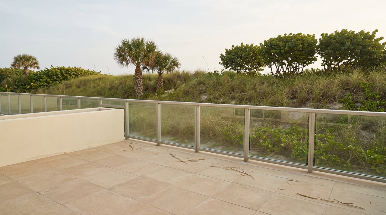
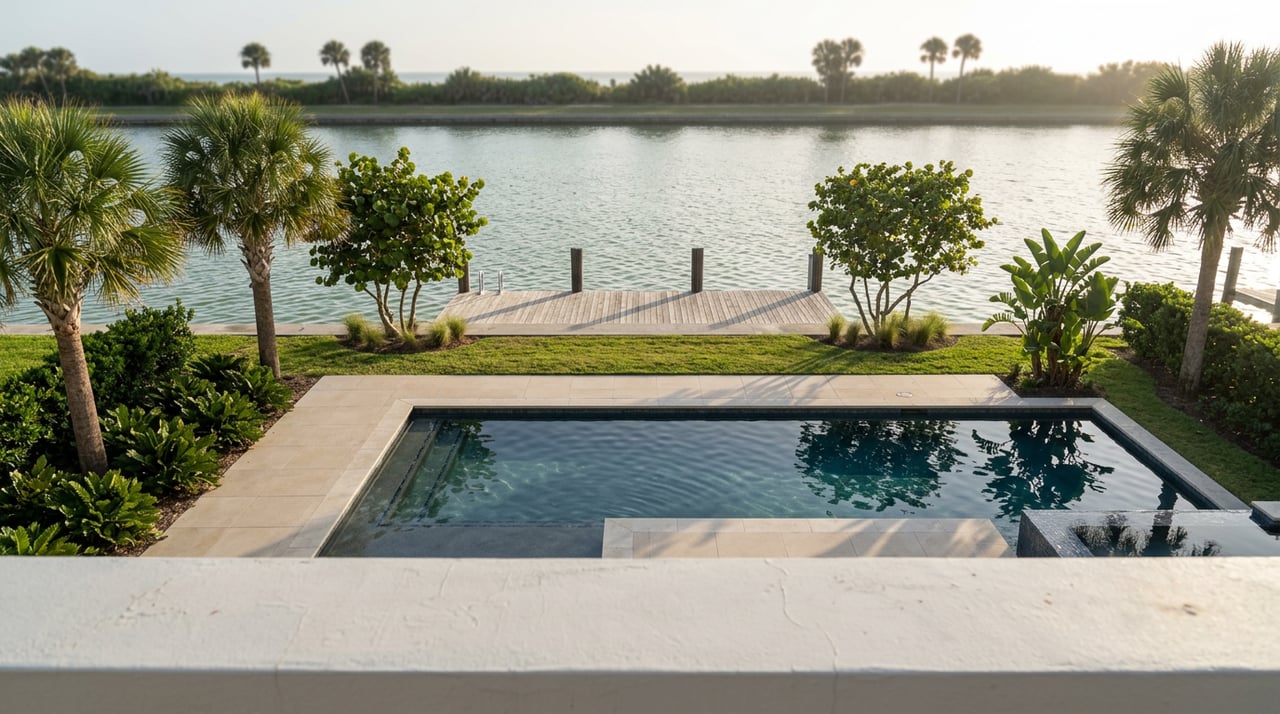
Step onto a balcony overlooking Sarasota Bay at golden hour, and the color story practically writes itself: pale sand, shifting aqua water, and a sky that fades from coral to lavender. That everyday scenery is exactly why a coastal color palette feels so natural inside Sarasota homes, where the light and the water do half the design work for you.
Choosing coastal tones is not about painting every wall turquoise or covering shelves in seashells. It is about pulling the softest hues of the Gulf indoors, so your rooms feel calm, bright, and connected to the landscape just beyond the glass.
Whether you are refreshing a condo near Siesta Key or styling a space inland, the right palette can make your Sarasota home feel like an extension of the coastline. Here is how to build one that looks effortless and stays timeless.
Key Takeaways
- A Sarasota coastal palette leans on soft aquas, sandy neutrals, driftwood grays, and warm whites drawn straight from the Gulf shoreline.
- The region's bright, warm light changes how paint colors read, so testing swatches on your own walls matters more than the store sample.
- Open living areas, waterfront-facing rooms, and outdoor lanais are where coastal color makes the strongest impression.
- Restraint keeps the look sophisticated, letting a few coastal tones set the ambiance without turning your home into an overly themed space.
What Colors Define a Sarasota Coastal Palette?
A Sarasota coastal palette centers on soft aquas, seafoam greens, sandy neutrals, driftwood grays, and warm whites, accented with touches of coral and deep Gulf blue. These shades echo the quartz-white sand of Siesta Key, the sea grape leaves along the shore, and the layered blues of Sarasota Bay.
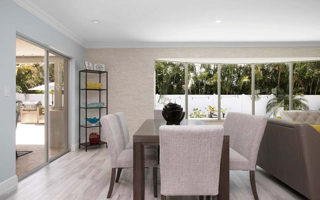
Neutrals do most of the heavy lifting in homes in Sarasota. Warm sandy beiges and soft greiges keep interiors feeling sunlit rather than cold, and they pair beautifully with the crisp whites that reflect the region's abundant natural light.
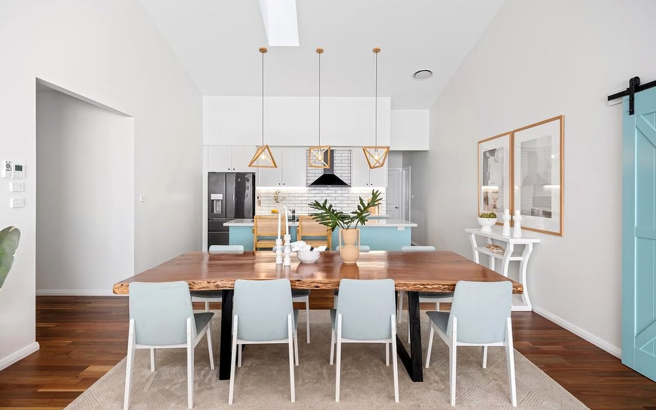
From there, you layer in accents. A muted aqua on a kitchen island, a coral throw pillow, or a driftwood-gray console adds personality while keeping the palette grounded in the coastal setting that defines Sarasota real estate.
Colors That Anchor the Palette
- Warm whites and soft greiges work as the backbone, keeping rooms bright and flexible.
- Soft aqua and seafoam bring in the water without overwhelming a space.
- Sandy tans and driftwood grays echo the shoreline and add natural warmth.
- Coral and deep Gulf blue serve as accents that give the palette energy and depth.
How Does Sarasota's Coastal Light Affect Your Color Choices?
Sarasota's bright, warm Gulf light makes cool coastal tones read softer and keeps whites from feeling stark, so shades that look pale on a swatch often come alive on the wall. The abundant sunshine here can pull out undertones you never noticed in the store, turning a plain white slightly yellow or a gray faintly blue.
West-facing rooms that catch the sunset over the Gulf glow warm in the evening, which flatters sandy neutrals and coral accents. East-facing spaces stay cooler and crisper in the morning, making them ideal for aqua and clean whites.
Because of this, testing is everything. Paint a large swatch on more than one wall of the room and watch it across the day before committing, so your coastal palette looks right at sunrise, midday, and dusk.
How To Work With the Light
- Test paint colors on your actual walls, since Sarasota light shifts undertones noticeably.
- Lean into warmer neutrals in west-facing rooms that catch the evening Gulf light.
- Save the crispest whites and aquas for bright, east-facing spaces.
- Check samples in both natural daylight and evening lamplight before you decide.
Which Spaces in Sarasota Homes Suit a Coastal Palette Best?
Open living areas, waterfront-facing rooms, kitchens, and outdoor lanais are the spaces in Sarasota homes where a coastal color palette has the most impact. These are the rooms that connect most directly to the light, the water, and the indoor-outdoor lifestyle that draws people to the area.
Great rooms and open-concept layouts benefit from a consistent neutral base, so the palette flows uninterrupted from the kitchen to the living space. A soft coastal backdrop also lets your furnishings and Gulf views take center stage.
The lanai is where Sarasota living truly unfolds, so carry your palette outside with driftwood-toned furniture, aqua cushions, and warm-white planters. This continuity makes real estate in Sarasota feel larger and more cohesive, blurring the line between inside and out.
Where Coastal Color Works Hardest
- Open living and dining areas, where a neutral base ties the whole floor plan together.
- Kitchens, where soft aqua or seafoam accents feel fresh against warm-white cabinetry.
- Waterfront-facing rooms that already borrow color from the bay or Gulf.
- Lanais and pool areas, where coastal tones extend the palette outdoors.
FAQs
What Is the Most Popular Coastal Color for Sarasota Homes?
Soft aqua and warm white rank among the most popular coastal colors for Sarasota homes, because they capture the Gulf water and bright shoreline light at once. Many homeowners build a neutral sandy base first, then use aqua as a signature accent throughout the space for a look that stays fresh year after year.
Do Coastal Colors Add Appeal When Selling a Sarasota Home?
Yes, a well-chosen coastal palette can broaden a home's appeal, since soft, light-filled tones photograph beautifully and help buyers picture the relaxed lifestyle Sarasota is known for. Neutral coastal colors also give buyers a clean canvas, making rooms feel bright, open, and move-in ready.
How Do You Keep a Coastal Palette From Looking Too Themed?
The key is restraint and quality materials, so lean on natural textures like rattan, linen, and light wood rather than literal beach motifs. Let two or three coastal tones lead, keep the accents minimal, and your Sarasota home will feel elevated.
Bringing Your Sarasota Coastal Color Palette to Life
A coastal color palette is one of the simplest ways to make a Sarasota home feel calm, current, and connected to its surroundings. When you start with warm neutrals, borrow the aquas and sandy tones of the shoreline, and let the light guide your choices, the result feels timeless rather than trend-driven.
The best coastal interiors reflect the way you actually live near the water, balancing beauty with everyday comfort. Whether you are updating a condo, staging a listing, or searching for your next place along the coast, thoughtful color can transform how a space feels.
If you are ready to find a home that fits your vision or want guidance on presenting your current one, I would love to help. Reach out to me,
Chris Carpenter, to explore Sarasota homes, and let's bring your coastal palette to life.